Altitude:
A designed system for a
1970's Rock & Soul Music Festival
Some of the greatest, most iconic music was created in the 1970s that still stand the test of time 50+ years later. However, this vast market of both nostalgics of those who grew up on this music, and people like me who still listen to it, is untapped.
So in this case study I decided to design to bring together generations into a 3-day 1970's music festival to celebrate the iconic era. An experience where both lovers of and those actually from the 70s can come together through music.
Create a fully designed system and high-fidelity app prototype for a music festival individually.
UI / UX Designer
UX Researcher
Product Manager
Context
11-Weeks
September 2024 - December 2024
Figma
Timeframe:
Tools:
Role:
Skip To Design
Skip to Prototype
Skip to Research
The Research Stage
In order to have a strong foundation for my design of the festival's system, the most important stage was conducting through research. Specifically, I conducted initial research, competitor analysis, and created personas/a customer journey.
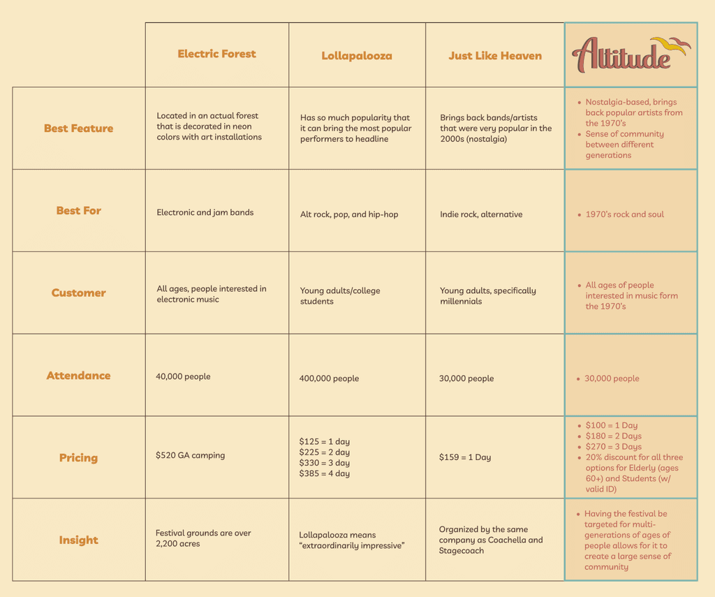
In my initial research, the three festivals I chose to research were Electric Forest, Lollapalooza, and Just Like Heaven. These festivals were chosen as some have similar target audiences, similar genre, or similar vibes/atmosphere as my festival.
Through the use of this table, I then conducted a competitive analysis of other music festivals. By doing this, I was able to figure out what would be best for my music festival’s overall design.
Initial Research
Competitive Analysis
1.
Electric Forest is a two weekend long electronic music festival located in Rothbury, Michigan. The festival is known for it’s extravagant and color decorations in an actual forest.
2.
Lollapaloza is a 4-day alternative rock music festival located at Grant Park in Chicago, Illinois. They provide a diverse selection of artists to see perform, and has created a pop-culture legacy.
Just like Heaven is a single day indie rock music festival located in Pasadena, California. The festival is known for it’s nostalgia factor for teens in the 2000’s who were fans of bands from that era.
3.
"The High
Schooler"
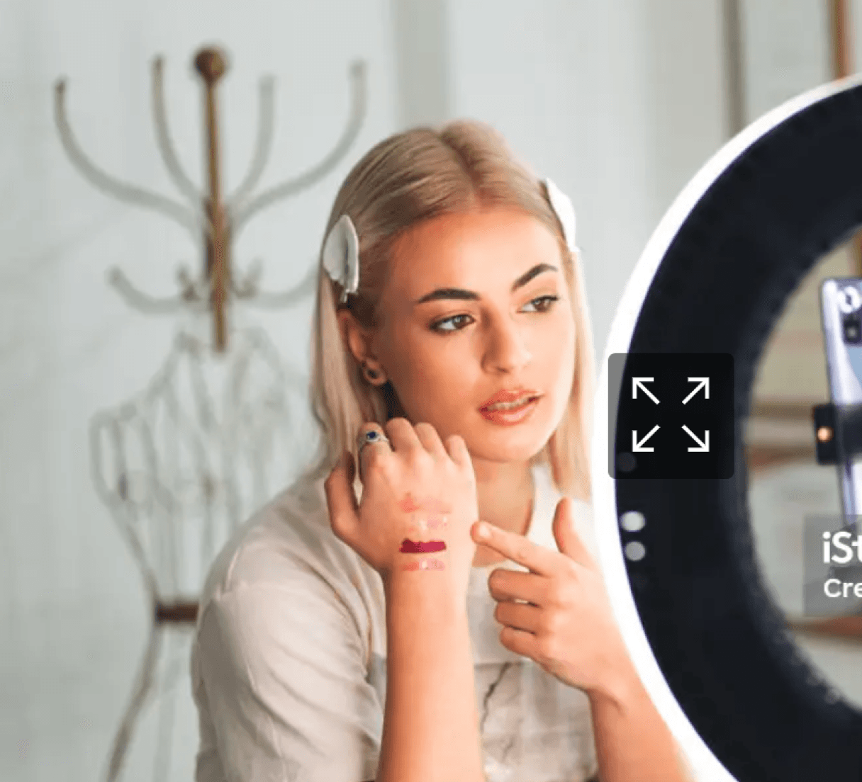
Persona 1: Charlie
Age: 17
Backstory
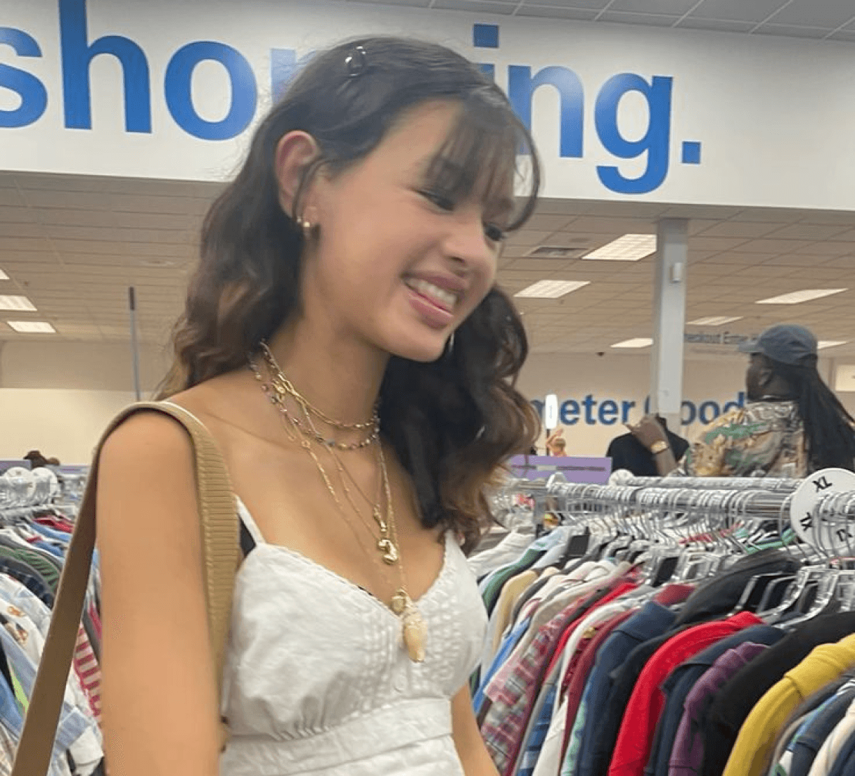
Charlie is a senior in high school from the Seattle area. She is consdiering what college to attend next year, and UW is one of her top choices. She wants to major in Biology with a minor in music. Spends most her time listening to music or playing the piano and singing. Saved all her money for a ticket to this music festival.
Favorite Brands
Resources
She is a novice at attending concerts/festivals. Only ever attended one concert before, and her mom handled getting the tickets, so this time her mom is making her do it on her own. An obstacle with getting tickets for Charlie is the fact that tickets go on sale while her school is still in session.
Goals
Charlie’s main goal is to figure out her ride situation to the festival. She doesn’t know if from her her house it would be better to take the link, bus, or Uber. She wants to not have to park her own car, but also is on a budget on how much she can spend and has not spent a lot of time on public transportation.
Emotions
Charlie is super excited for the festival because her favorite throwback artists are performing, who rarely go on tour. However, she is also nervous because of the big crowds and is scared about potentially getting lost or pushed around. She also is nervous because she will be one of the youngest attendees to the event.
Scenarios
Charlie uses both Apple Maps and Google Maps to compare how long each form of transportation will take to the festival. She also checks the uber app to determine how much a ride to and from will cost. Ultimately, she determines that the bus is her most reliable and cheapest option.

Persona 1: Hannah
Age: 21
Backstory
Hannah is a recently turned 21 junior attending the University of Washington and studying Communication, originally from LA. She is in a sorority, and has the position of VP of Recruitment. She loves going out and posting about her college life on Tiktok. She has gained over 300,000 followers on the platform.
Favorite Brands
Resources
She is an expert at attending concerts, but not music festivals. She knows how to use ticketmaster very easily. She also is hoping for this event that she can save money by using a student discount that the festival has.
Emotions
She is super excited about going because Seattle has never had a music festival as big as this one. However, she is somewhat nervous because she has never attended a music festival before. She also does not know much about 70s music.
Goals
Hannah wants to make sure to capture all the moments of the before, during, and after of the festival for her Tiktok. Essentially, she will be making a vlog for her followers. She also wants to get a student disocount for her tickets.
Scenarios
Hannah is able to accomplish her goal of capturing the moments of the festival by filming small increments of the festival on her Tiktok and then splicing them altogether and eventually posting the video a day after the festival.
Insights overall:
- Having the atmosphere match both the genre of music and customer is essential
- Music festivals can be for people of any age, not just younger audiences
Personas
These personas were created to showcase the diverse potential attendees to the music festival. All three have different ages, situations, and circumstances.
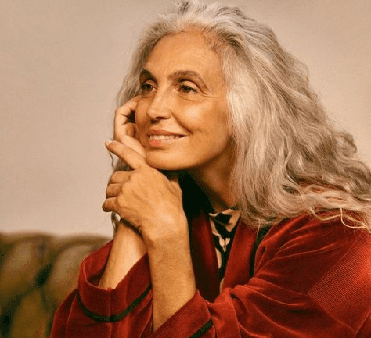
Persona 1: Joanne
Age: 65
Backstory
Joanne is a grandma from Ravenna. She has two kids and four grandchildren. She lives with her husband of over 40 years and their King Caviler Spaniel. She absolutely loves music from the 70’s and saw many of the artists performing back in their prime. She is very eccentric and non traditional.
Favorite Brands
Resources
While she has attended many concerts and festivals in her lifetime, it has been a long while since she has been to one recently. So, she has to have assistance with using Ticketmaster to buy her tickets from her grand kids since shes never done this before.
Emotions
Super excited to relive the past for a couple days at the concert. Feeling super nostalgic and ecstatic that she will get to wear her old clothing form the 70s that have been put in a box up until now. Feeling slightly anxious on if she will have enough energy for the long days at the festival.
Goals
Joanne wants to surprise her grand kids by buying them all tickets to come with her to the festival but she does not want them to know until the day before. Joanne also wants to get the tickets for cheaper by using the elderly discount for her ticket.
Scenarios
Joanne makes sure to pay attention when her oldest grandson assists her on Ticketmaster with the process of buying the tickets. Joanne tells him to go help his grandpa with something. When he is gone Joanne adds 4 more tickets to the cart and buys them for her and her family. She also applies the elderly discount.
"The Influencer"
*"The Nostalgic"
Personas
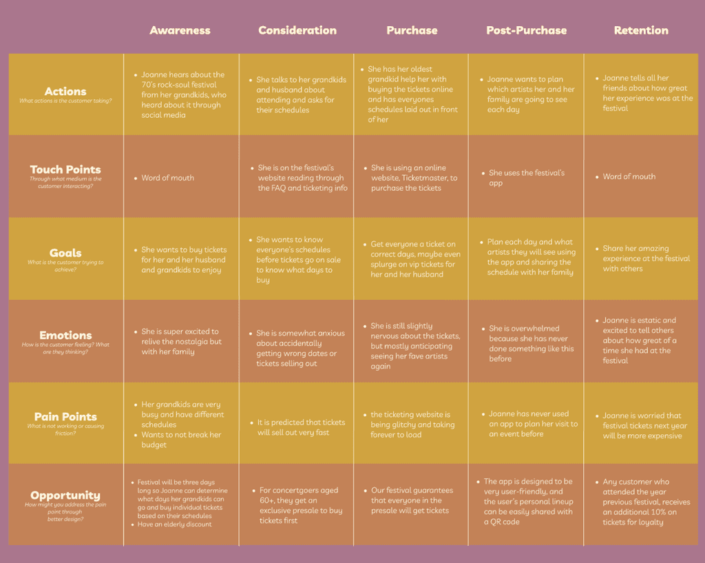
Customer Journey
I chose Joanne to do the customer journey. The reason is because I want people of her age demographic to be my target audience for my festival because of the nostalgia feeling. Also, because technology for people in this age range tend to not be as skilled at buying tickets to a festival online, it adds another challenge with this specific customer.
Insights Overall:
The bigger a group wants to go to an event together, the more planning and conflicts will occur
QR codes are an easy way for information to be shared with one another
The Difference
Core Value Proposition:
What exactly makes my music festival, Altitude, standout in comparison to others?
Altitude Music Festival is a 1970’s rock and soul festival. This festival is for 1970s music enthusiasts, or those wanting to relive and experience nostalgia for that era of music. The allows for the most popular musicians from the 1970s to come together and perform once again.
Unique Selling Point:
Unlike other music festivals, this event is meant to bring together the different generations under the one common love of 1970’s music. It also provides both a student and elderly discount to further encourage this.
The Design Stage
Now that the customer and competition research has been conducted, I was able to have a strong foundation to move onto one the more exciting stages- Design!
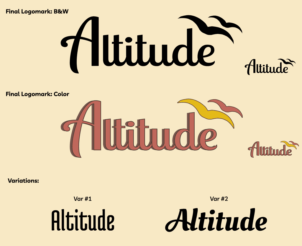
I wanted to convey a feeling of boldness, freedom, and groove because they represent the feelings of how rock and soul music from the 70s make people feel when they listen to it.
To accomplish this, I chose Lobster Two, which is a script font.
The font uses ligature in lowercase letters, which creates a sense of togetherness. Togetherness is important because the festival wants to bring together different generations, type of people, music genres, etc all together to enjoy good music and vibes of the 70’s. By using uppercase for only the “A” creates a feeling of being higher and on a different level of the other lowercase letters. I further emphasize the feeling of freedom and altitude.
“Altitude” relates to my music festival because the word means being high up, and makes you feel a sense of freedom in the sky. So, since the festival’s theme and music genre is 70’s rock and soul, these are some the “highest” or “peak” era of music as it was a time when so many classics were created in music that are still played today.
Wordmark & Logomark
Why Altitude?
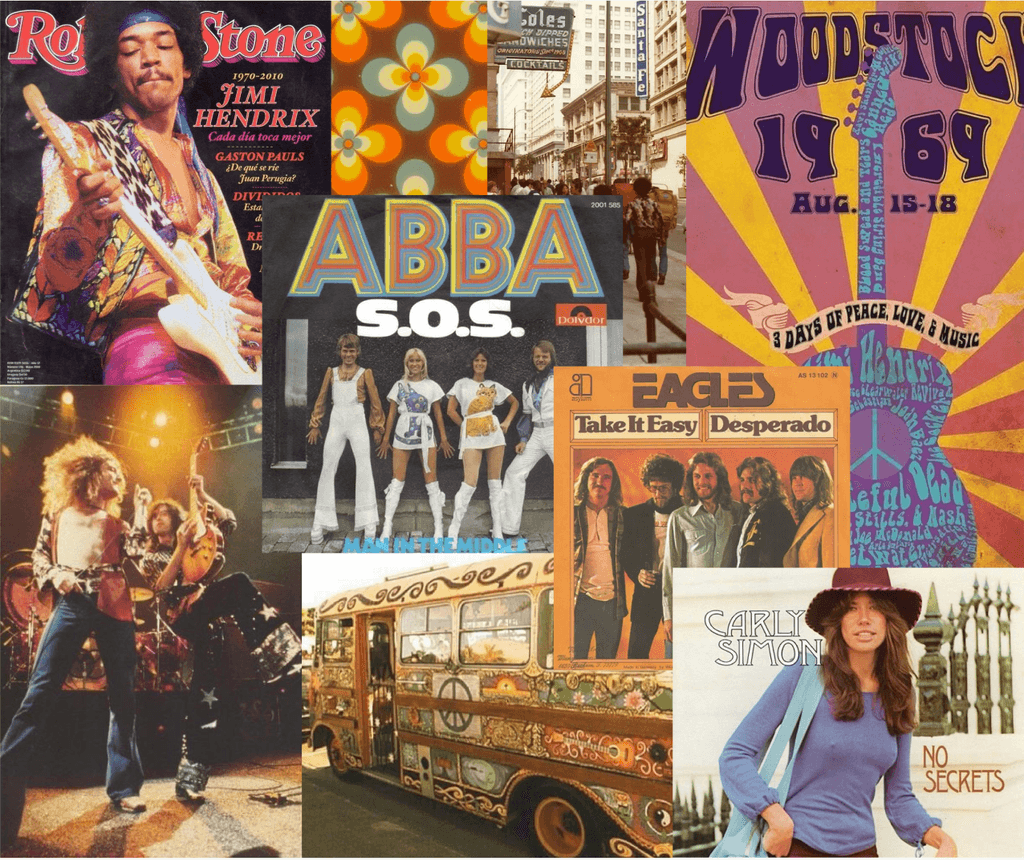
Mood Board
When designing my festival, the photos in my mood board were heavily inspired by them. This is because these are all graphics/photos/album covers based on or actually from the 70’s music scene.
Insight:
An insight I gained from doing this is that a lot of the color schemes from the 70’s is very similar and is certainly on the warm tone side. Orange is a very popular color for this time.
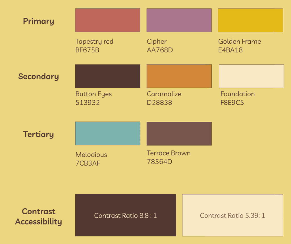
Colors
I wanted to convey a feeling of boldness, the 70s, and vibrancy. To accomplish this, I chose a split complimentary color palette, which features browns, reds, oranges, and a tinge of teal.
This scheme reflects boldness and vibrancy because all of the colors were chosen to be bright colors. This will capture people’s attention to my festival and will standout. This scheme also was chosen because it reflects the 70’s colorful aesthetic. A lot of the colors were also from my mood board, which were all pictures actually from the 70’s music scene.
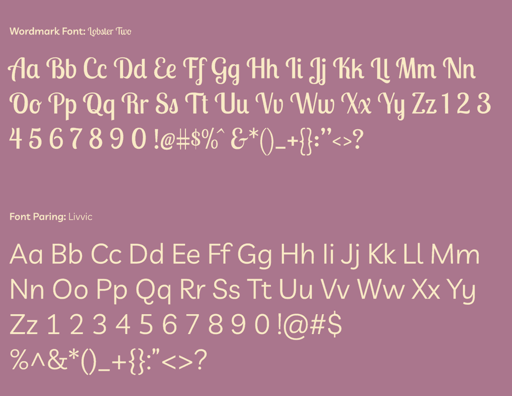
Typography
While the two fonts initially may seem to not match each other well, they actually have similar elements. For instance, both of the fonts lowercase “a” is without an ear.
Also, I wanted to make sure to use a font that is easy to read because the word mark font uses ligature, which is okay when the font is big. However, for smaller font the ligature makes it hard to read, especially form afar. So Livvic was a good pair to Lobster Two because it does not use ligature, but for some of it’s lowercase letters (like l and y) the terminals are curved, making it go well with wordmark's script font.
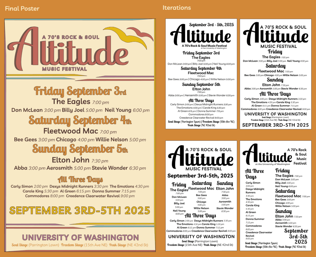
Poster
In my poster, I used bold weight to emphasize the things I wanted people to look at and catch attention. For instance, having the artists’ names in bold was important for people to see, while the times of the artists were not as important for people to see from afar.
Perhaps the most difficult part of designing the poster was choosing the placement of the text. Ultimately, I decided for the texts to be read from top to bottom, with more attracting info at the top. I also aligned all the text to be in the middle to look like the back of a concert t-shirt.
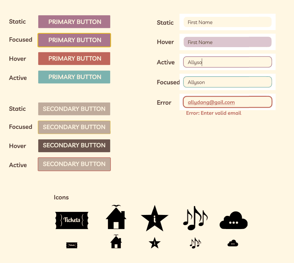
UI Style Tiles & Icons
I chose five icons home, tickets, info, lineup, and more.
I wanted the icons to relate to my logomark. To accomplish this I made sure that all the icons I made had sharper edges, just like how my wordmark has sharp points on each letters’ terminal. Also, when an icon has any word/letter, I used the same font for those as I did in my wordmark, Lobster Two, which my logomark was made from.
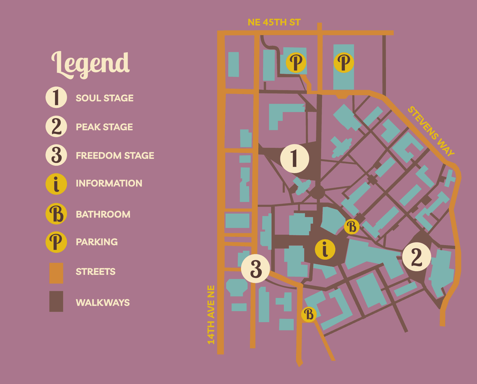
Festival Map
For the final map, I made sure that all UW building would be in a brighter contrast from the background color. Originally they were a muted red color, and after seeing the map printed out, it was hard to distinguish the buildings from the background because the contrast was not great.
I also made sure that I traced a big portion of the map of UW because I think this will make it easier for attendees to navigate since some parts of the festival are somewhat farther away. I also included main streets so that it would be easy for cars to use as a map as well. Lastly, I removed small walkways that were unnecessary and might confuse the attendees.
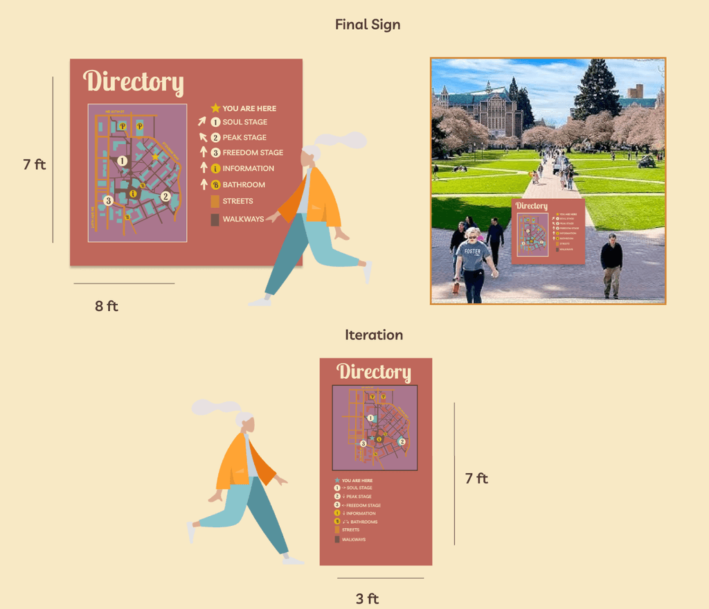
Festival Signage
The signage I created is a form of primary signage since it is a directory that directs and guides the attendees of my festival where to go from the location of the quad. I chose this form of signage because while apps can help guide attendees, for some people, physical maps are easier to use. Especially since a lot of my attendees will be an older audience, some may prefer a physical directory.
I made sure that the directory would be quite large for people to be able to see it from afar. I also used the same fonts and color palette as my musical festival so it was obvious it is for the festival. I also made the font large and bold so people can read it from a slight distance.
The Prototyping Stage
Now that a brand book has been fully designed, I was able to combine the design and research stage together to get to the final stage- Prototyping!
Userflow
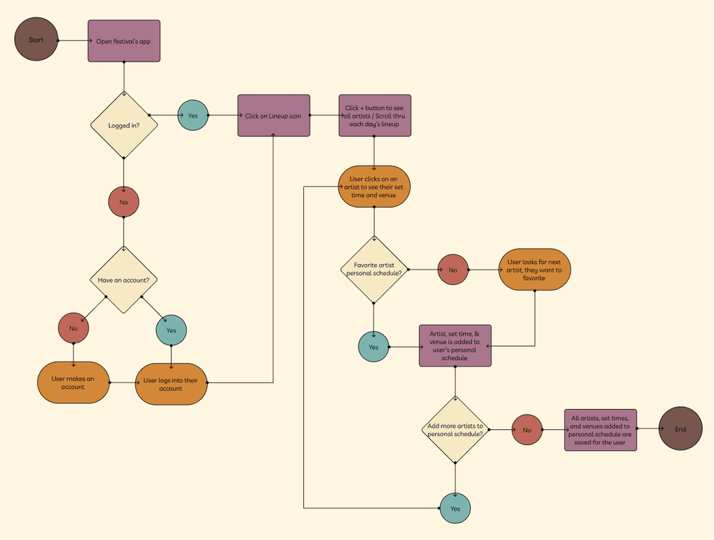
The user flow task is a schedule planner. It will allow users to create a “personal lineup” where they can add the artists they are planning on seeing (favorite them) and the app will then sort them by time and day. This will make the festival much less overwhelming, and simplify the planning for them in the app.
The chosen persona for the user flow is Charlie. I chose her because since she is younger, she only really knows certain artists performing at the festival (Like Fleetwood Mac, The Eagles, and Billy Joel). So, she wants to favorite those artists so she doesn’t miss them.
Insight:
An insight about my userflow is that it is meant to be very simple and intuitive to the users because my festival has a wide range of age groups attending.
Wireframes
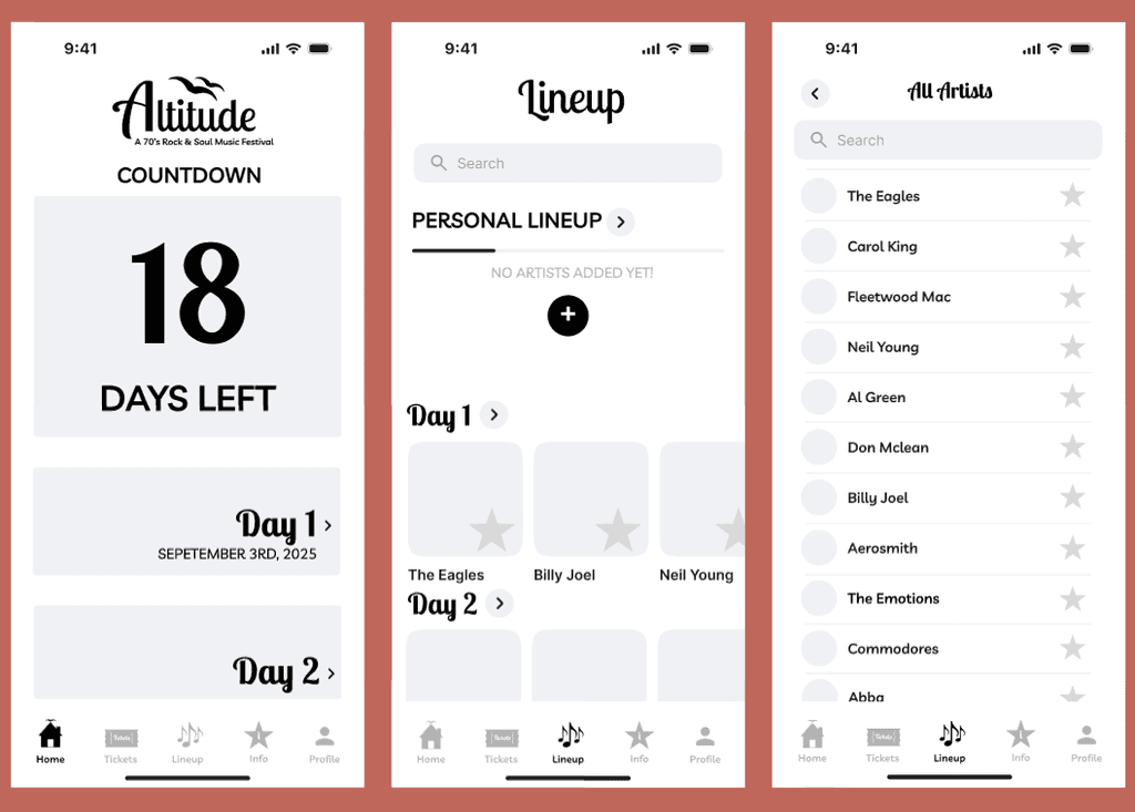
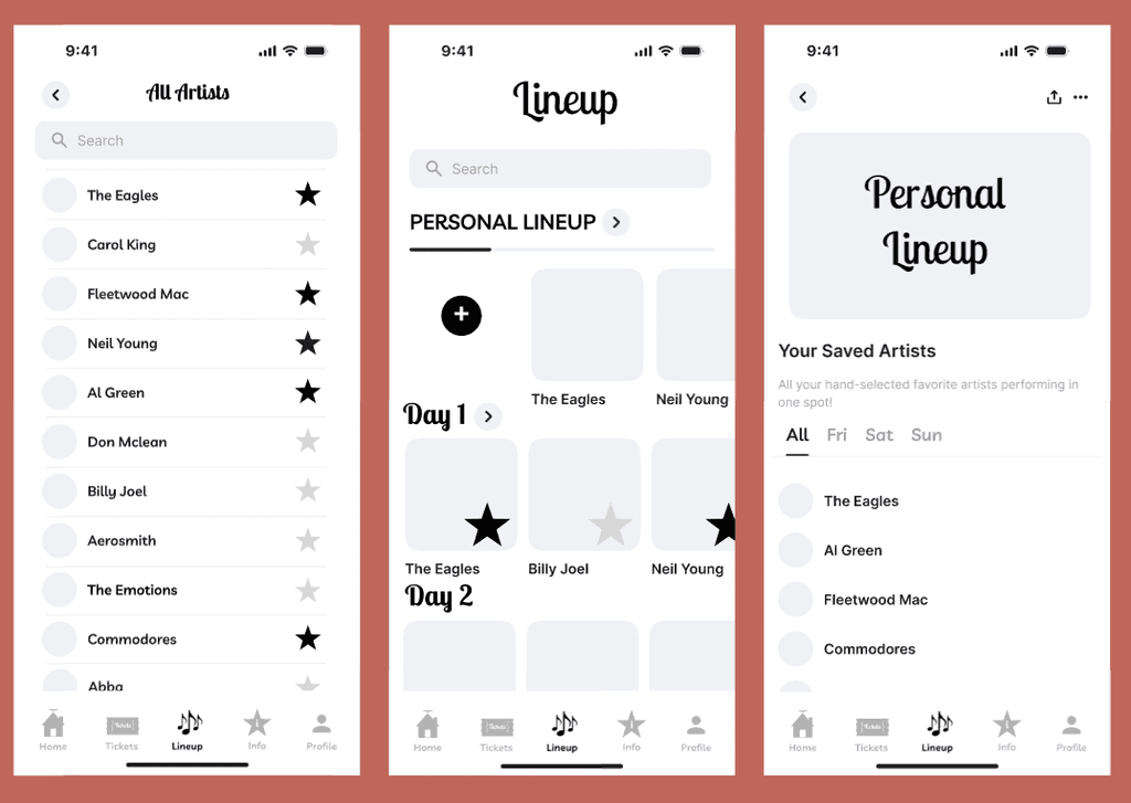
Throughout creating the wireframes, I made sure to make it consistent with my festival’s brand by using my two main fonts Lobster Two and Livvic. I also used most of the icons I made in a previous assignment into my wireframes for the bottom navigation menu. I overall designed the wireframes to not be overly complicated so that it could be self explanatory for users to eventually use.
User Testing Insight
The user testing made me realize that I had no actual plan for what clicking the + button would then lead to. So of course, when creating my final wireframes I made sure to have a screen for that interaction. The user testing also made me realize that there are some parts I completely miss/dont think about that the user will notice.
Mobile Interface
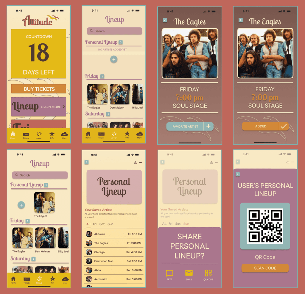
The main focus of this prototype’s mobile interface is creating a personalized lineup schedule for a user.
First, an intentional design choice was to make the interface colorful and bright because I wanted it to match the vibe of my festival and create cohesion.
Second, in the lineup page there are multiple ways to add an artist to the user’s lineup (either clicking the + icon, or going through each of the day’s lineups and adding artists like that). This was designed like that to allow the user to have a choice in how they want to look through artists and and them to their personal lineup.
And last, another design choice was to include a QR code of the user’s personal lineup to be able to easily share it with friends.
The Prototype
Now for the final deliverable of the festival's designed system- The mobile app prototype!
In this prototype demo, I created an interface that allows the user to create a personal lineup using Altitude's mobile app. The app is designed to be user-friendly and give the user multiple options to do the one task.
This app was designed entirely by myself, and was made through Figma.
Reflection
This case study was my first introduction to being able to really use my design skills and implement design principles from my courses as a HCDE Student. Through this case study, I was able to gain hands-on experience designing on Figma, and creating interactions/prototypes,
Specifically with creating a fully-designed system for a music festival, I learned just how much effort and thought has to be put into creating one. Every single design choice has to make sur to keep the personas in mind, and have actual rationale to backup my choices.
While this festival may just be a concept, I believe it is actually feasible and would love to be able to actual implement it fully one day!
Allyson Dang @ 2024