Connect Crew:
Volunteering made easy for college students
For many volunteering was a larger aspect of their lives during their high school years. Perhaps due to many schools requiring them, or simply having more time. However, slowly and slowly, it becomes nearly impossible to find time to volunteer especially for college students to balance. Not only that, but the process of finding places to volunteer is an extremely overwhelming process.
But what if there was a solution that made finding volunteering opportunities both easy and convenient? A solution that made it significantly easier for organizations to find reliable volunteers? This is what my team and I decided to design the solution for.
Create a user-friendly, empathetically designed high-fidelity app prototype for students wanting to volunteer and for volunteering organizations to consolidate opportunities into one convenient spot for eachother.
UI Designer
UX Researcher
Context
3 UI Designers
3 UX Researchers
20-weeks
September 2024 -
March 2025
Figma
Miro
Canva
Timeframe:
Tools:
Team:
Role:
Research Stage
Ideation Stage
Design &
Protoyping Stage
There is a lack of volunteering from college students, and also a lack of available reliable volunteers available for organizations.
In order to actually confirm this is an actual problem college students and organizations faced, we conducted customer research.
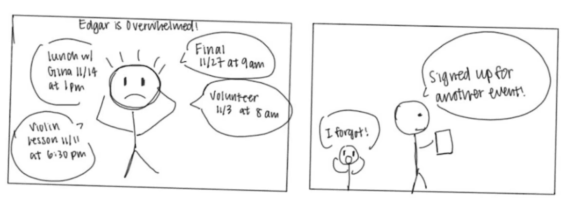
Not enough time: College students are unable to fit volunteering into their already busy schedules
Efficiency: Volunteering organizations need more volunteers in a more effective way that are reliable and will actually show when they sign up
How can we confirm this problem?
Full research report here
The Problem
Research Stage
3 Interviews were conducted
Interviews ranged from 15-30 minutes
3 participants were recruited, 2 students and 1 coordinator
Inclusion criteria: current students from UW who have participated in volunteering opportunities in the past, people who agreed to participate in the interviews, and organizations that have experiences in recruiting volunteers
Exclusion criteria: people who have never participated in volunteering events
Method
Results
Condense Opportunities
Our interviewees mentioned that they would really like for all the volunteering opportunities to be condensed in one spot.
The process of finding volunteer opportunities very tiring and unrewarding, as they are forced to go down multiple different avenues in order to find a single volunteering opportunity.
Word of
Mouth
Volunteer organizations, they typically are finding volunteers through word of mouth advertising, or direct contact with potential volunteers
It is not always a reliable method of recruiting because volunteers sometimes do not actually show up for the opportunity
Busy
Schedules
An important commonality across our participants was that they all have busy schedules
College life often leaves minimal room for additional commitments, and volunteering events are likely to have time conflicts with their classes

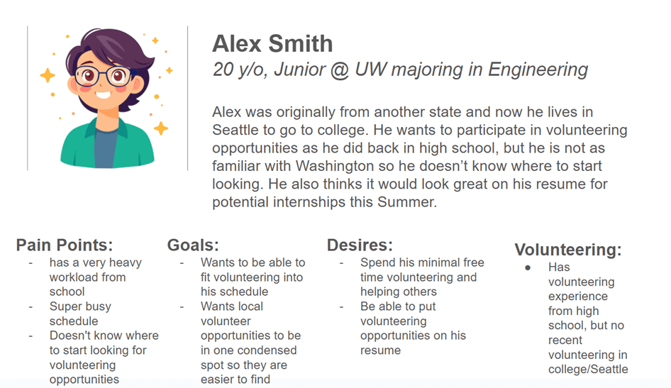
Personas
Our team then created personas based on the results from the three interviews. This was done in order to better understand pain points and user needs better for college students and volunteer organizations.
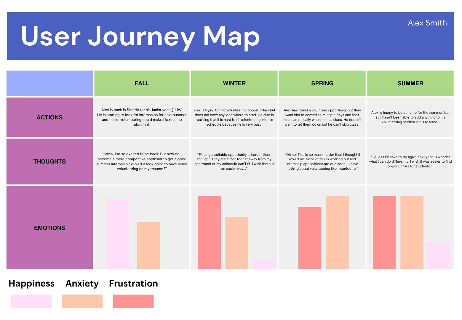
User Journey Map
Competitive Analysis
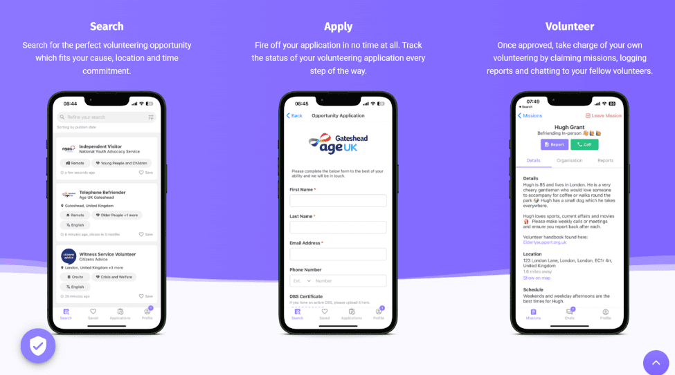
Volunteero: UK app that has potential volunteers search, apply, and volunteer for opportunities
Only works in the UK
Costs organizations money to join
Has no consequences for volunteers if they do not show up to an opportunity they signed up for
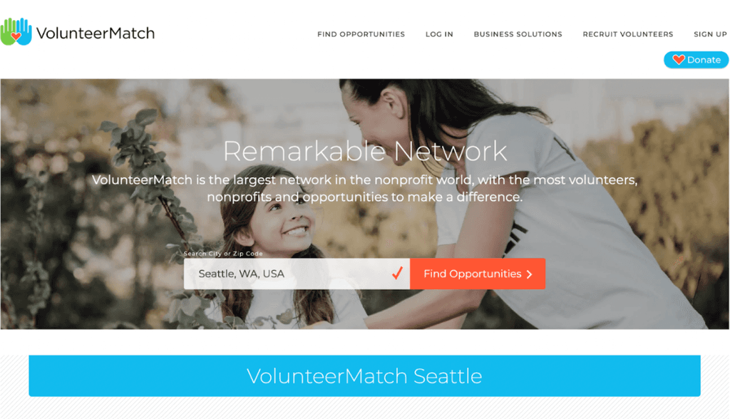
VolunteerMatch: A website that potential volunteers can find local volunteering opportunities
Requires a donation from organizations to sign up
Only available in English
Has no consequences for volunteers if they do not show up to an opportunity they signed up for
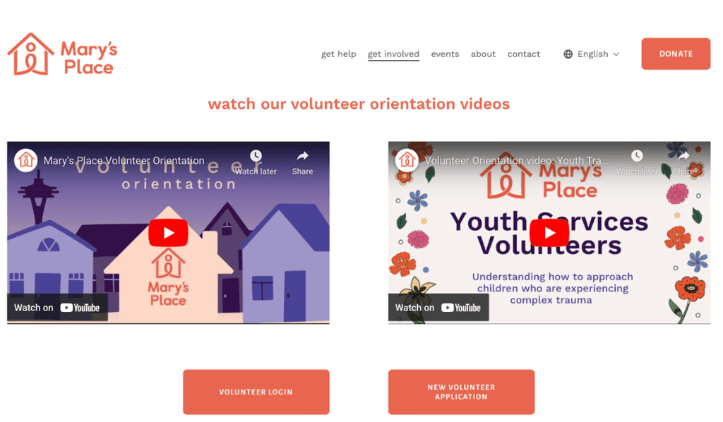
Mary's Place: A website that potential volunteers can find local volunteering opportunities
Website is difficult to navigate
Has no consequences for volunteers if they do not show up to an opportunity they signed up for
A competivie analysis was conducted by our team in order to understand and ideate a product that has not been created yet, and standout compared to competitors.
Full competitive analysis here
Ideation Stage
What can we design to solve this problem?
Now that we confirmed from customer research that this is a problem, we moved onto the design stage that address a solution to insights from the competitive analysis and research we conducted.
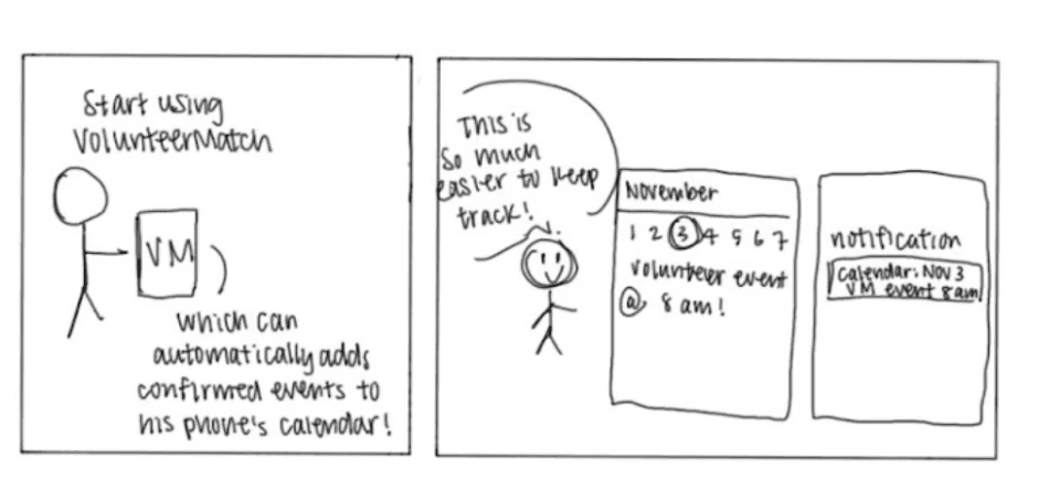
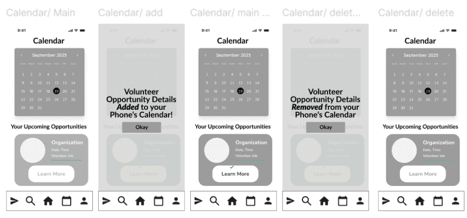
This calendar sync feature serves as a way to organize events for users so they can better manage their time and plan ahead of time. When users decide on a specific opportunity they want to participate in, the app automatically adds the event to their phone’s calendar, including its date, time, and location. This gives the user a comprehensive view of their schedule, centralizing their to-do list all in one spot.
With the research and design goals in mind, our team concluded that creating an app for volunteers and volunteering organization would be the best system.
Design Goals
App feature storyboards
Volunteer Review
Full design requirements here
#1
Centralize access for how users find volunteering opportunities
#2
Connect college students with volunteering organizations
#3
Encourage students to participate in civic engagement that benefits communities


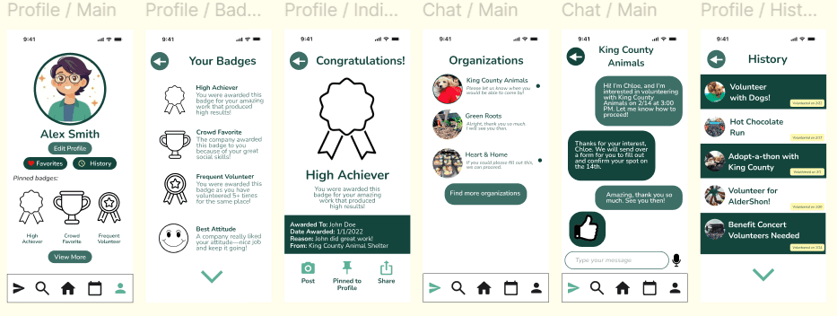
The idea for this feature is to create accountability for volunteers to actually show up to opportunities they sign up for. After an opportunity occurs, volunteer organizations then can rate the volunteer and have it be visible on the volunteer's profile. Inspired by the Uber driver rating system.
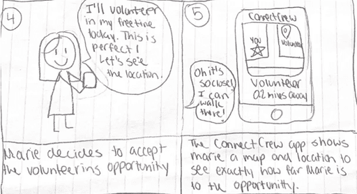
Opportunity map:
The idea for this feature on the app is to provide users with volunteering opportunities nearby their current location. This map and notification idea also eases users with the hassle of having to actively look for local volunteering opportunities, as this was a problem that our interviewees said they had. It allows for the search to be done for the user, rather than the other way around.
Calendar Sync:
Design Review from Industry Profesionals
As a final celebration of our work from the past ten weeks, our class had a design critique with industry professionals with years of experience, as well as our fellow peers. Through this review, our team was able to gain critiques and made us think about our project in ways we never thought about before. This meant being open minded to changing our concept.
Design Choice
The rating system of volunteers could pose as counteractive to encouraging college students to volunteer.
Badge System
After a volunteer opportunity the organization can then give out specific badges to the volunteer for their excellence. Then these badges will be visible on the volunteer’s profile, for future organizations to gauge if they would want the volunteer for their opportunity
Research
A critique from both of the industry professionals was about how getting as many interviews would benefit us greatly in the development of ConnectCrew
Limitations
Due to the time constraint of turning in the interview transcripts on time on top of other assignments, three interviews was the best we could have done for that time being. However, we understood how foundational the research step is in creating successful designs, and agreed with the professionals.
Two Perspective Design
Our team made sure that when designing the prototype for the platform, ConnectCrew would be extremely easy to use for organizations and to stremline to process of finding volunteers.
Problem Space
Consider more of the volunteering organizations’ perspective for the app, as they are essential stakeholders in our space
Design & Prototyping Stage
3 Chosen Critical User Flows
To kick off this stage, we then decided on the three user flows we wanted our prototype to focus on:
#1
Swiping for volunteering opportunities
#2
Badge reward based system
#3
Syncing upcoming opportunities to phone calendar
Low-Fi Prototype & Concept Testing
Task 1:
Task 2:
Task 3:
This stage consisted of wireframes and then were concept tested with three participants.


Concept Testing Results
Design of prototype is not cohesive
Brand needs a logo
Swiping feature should say somewhere “swipe” so its more obvious
Search bar and filter options should be more visible
Profile page should be more minimalistic
We then used these insights to shape our mid-fidelity prototype
Mid-Fi Prototype & Usability Testing
This stage consisted of interating our low-fidelity prototype by including the insight from the concept test, and then were user tested with three participants.
Task 1:
Task 2:
Task 3:


Concept Testing Results
Design of prototype is not cohesive
Brand needs a logo
Swiping feature should say somewhere “swipe” so its more obvious
Search bar and filter options should be more visible
Profile page should be more minimalistic
We then used these insights to shape our mid-fidelity prototype
Usability Testing Results
It was hard to use the app because the navigation between flows were extremely disconnected and had to be directed by us
The calendar page needed a better purpose. Specifically that the calendar page didn't seem necessary, and instead could be repurposed to be simply an upcoming page
There was too much text on the swiping flow, and made the users feel overwhelmed by information.
We then used these insights to shape our final high fidelity prototype
Final High-Fidelity Prototype
Finally, we have reach the end stage of the whole design process withthe high-fidelity protype. In this, we made sure to include ALL the feedback we had gotten from our user-tests.
Concept Testing Results
Design of prototype is not cohesive
Brand needs a logo
Swiping feature should say somewhere “swipe” so its more obvious
Search bar and filter options should be more visible
Profile page should be more minimalistic
We then used these insights to shape our mid-fidelity prototype


Demo Video
To showcase all our work, we then created a demo video showcasing how we would intend ConnectCrew to be used by a university student.
Concept Testing Results
Design of prototype is not cohesive
Brand needs a logo
Swiping feature should say somewhere “swipe” so its more obvious
Search bar and filter options should be more visible
Profile page should be more minimalistic
We then used these insights to shape our mid-fidelity prototype
Reflection
After going through this whole design process, it was really rewading to see how my team and I first began, to where we ended up. Orginally we had no idea what direction we wanted to take the theme of "balance" to then see that we decided to go through the route of civic engament was awesome and unique.
Working in a team for 20-weeks, really made me understand the importance of communication for effective collaboration in a team. I realized how it can also be sometimes difficult to work in a team, especially when going through the actual design stages of the app because everyone has their own ideas of what a design should look like. But through the use of strong communication and empathy people in a team are able to work as one together which was a great accomplishment for us.
Lastly, looking back at our design process, it is clear at how visible and useful user testing is to create user-friendly platforms. This process requires HEAVY iteration that is constant in order to create a positive user-experience. So that means being able to keep an open mind when the feedback is not something you expect and interating from there. I also like how our design process really wasn't linear, which is what makes our design and concept so strong!
Allyson Dang @ 2024