Eventure:
The better ticketing option
The feeling of excitement that people get when an event in their town is happening is one the best feelings ever. Along with that though, is also one of the most stressful feelings ever when buying tickets for that coveted event. Most ticketing platforms are slow, require too much clicking between screens, not reliable, and overall just not user-friendly.
That is why our team of Human-Centered Design and Engineering students decided that there must be a solution and created a prototype app and key screens for desktop with the ticketing platform, Eventure. This was a group sprint completed in two weeks.
Create an app prototype and desktop key screens for the ticketing platform Eventure, that is both user-friendly and visually appealing in a group-sprint.
UI Designer (AD)
Product Manager (MC)
UX Researcher (JP)
UX Designer (LH)
2 Weeks
Figma
Context
My Role:
Team:
Timeframe:
Tools:
Skip To Design
In a two-week design sprint, our team was tasked with creating a ticket-purchasing flow, including identifying a persona, analyzing competitors, creating style book, delivering a mobile app prototype, and creating key screen for desktop.
The Task - Product Manager (MC)
Core Value Proposition:
Unique Selling Proposition:
Eventure is a ticketing service. For event-goers, who want a stress-free ticket buying experience,
Eventure provides a simple, easy ticket buying experience with a focus on a safe ticket buying process (MC).
Unlike StubHub, Eventure provides a safe, trustworthy ticket buying process through 2FA (2-Factor Authentication) and immediate and automatic ticket transfers, while also providing unique recommendations to users through connecting to Spotify (MC).
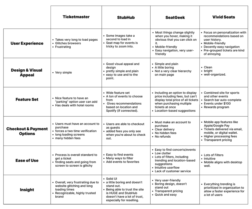
Before the actual designing and implementation can happen, our team had to understand what exactly users needs and pain points are. In order to do this, we created a customer persona and all conducted a competitive analysis. Led by UX researcher.
Understanding Users - UX Researcher (JP)
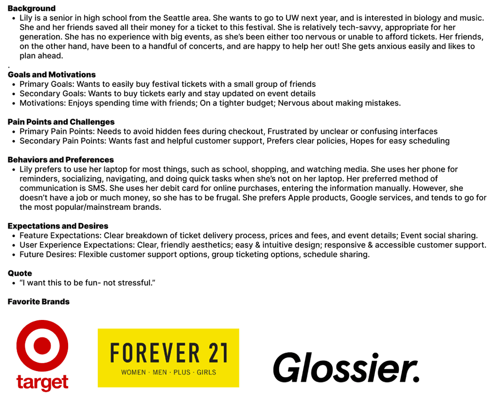
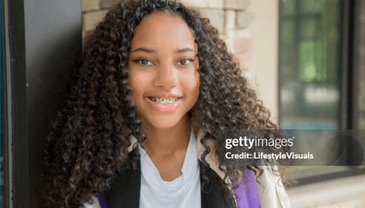
Persona: Lily, The Nervous High Schooler
Competitive Analysis:
Ticketmaster, StubHub,
SeatGeek, Vivid Seats
We built this persona to combine aspects of a customer that might make them nervous about using the ticket-purchasing interface.
Through this persona, we can work to ensure all possible pain points are addressed and that the site is easy to use and understand (JP).
Overall, overwhelming options without proper filtering can frustrate new users. A simple but recognizable UI is essential. Securing user trust is a top priority (JP).
Now that we understood what our customers would want and how to differentiate from other ticketing platforms, we now wanted to create a brand for Eventure.
I was the lead of creating a brand book including color schemes, typography, and style tiles. I then implemented the brand into the creation of app and desktop prototype.
Creating a Brand - UI Designer (AD)
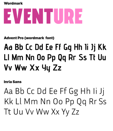
Wordmark and
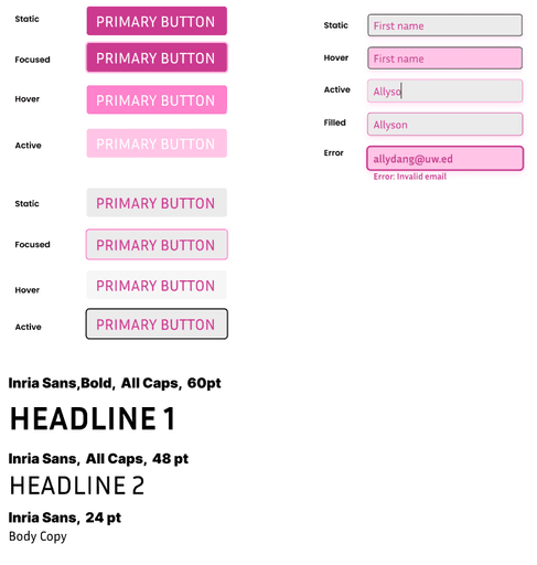
Typography:
Colors:
UI Style Tiles:
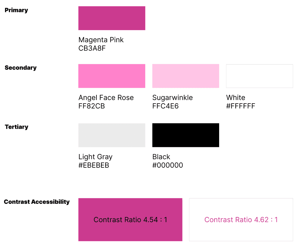
I wanted to convey a feeling of boldness, individuality, and friendliness with the color scheme.
To accomplish this, I chose a monochromatic color palette, which features shades of pink. This scheme reflects boldness because the primary shade of Magenta Pink is highly saturated and is able to standout very well and catch the audience’s eye. The scheme reflects individuality because the pink scheme was chosen since no other ticketing platform has the same colors. Lastly, the scheme reflects friendliness because pink is usually a color most would associate with happiness and warmth which we want user to feel.
In the Eventure wordmark, "Event" is a different and bolder color from the "ure" because I wanted the first part of the word to standout.
The reason I choose to pair Advent Pro with Inria Sans is because they look very similar, but I think Inria is slightly less “fancy” making it easier to read since it will be used in smaller pt size. They are also both sans-serif fonts. An anatomy part that makes the fonts go well together, is also how both fonts are quite sharp and flat. For example, the “s” letter’s spine for both fonts is sharper and flatter rather a more circular spine for an “s” letter.
Style tiles, otherwise known as "buttons" are used throughout the prototype. I created these to allow for cohesion in the visual aesthetics of the prototype.
In this stage, our team wanted to get into the mind's of potential users and determine what the most user-friendly experience would be for purchasing tickets for an event. All of our team created a user flow, and came to consensus on the best one. This was lead by our UX designer, LH.
The User Experience - UX Designer (LH)
The Chosen Userflow (AD):
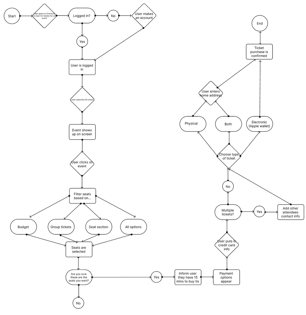
This userflow is what we determined to be the most efficient and realistic flow of a user buying a ticket.
I created this userflow.
Now that we have created a strong foundational basis for the ticketing platform, it is now time to actually put this information into the prototypes for Eventure. The design were led by the UX designer (LH) and UI Designer (AD).
The Actual Designs - UX Designer (LH) & UI Designer (AD)
Wireframes:

Mobile app wireframes:
Desktop wireframes:
Mobile app final design:
Desktop final design:


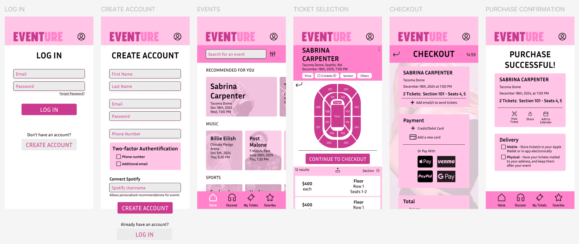
Final Designs:


In this stage, our team wanted to get into the mind's of potential users and determine what the most user-friendly experience would be for purchasing tickets for an event. All of our team created a user flow, and came to consensus on the best one. This was lead by our UX designer, LH.
The User Experience - UX Designer (LH)
The Chosen Userflow (AD):
This userflow is what we determined to be the most efficient and realistic flow of a user buying a ticket.
I created this userflow.

Everyone in our team was tasked with creating key screen wireframes for both the mobile app and desktop version. The wireframes were the first step in creating a basis for what the designs would look like.
The UX designer (LH) and UI Designer (AD), were the leads of completing the final designs for the mobile app and desktop. As the UI designer, I used the brand book that was created before to create cohesive-looking designs using Figma.
Finally, our team created the end-product of Eventure, the mobile app and desktop prototype using Figma.
The final prototypes were made sure to have:
The Prototype
The Prototype
In this stage, our team wanted to get into the mind's of potential users and determine what the most user-friendly experience would be for purchasing tickets for an event. All of our team created a user flow, and came to consensus on the best one. This was lead by our UX designer, LH.
The User Experience - UX Designer (LH)
The Chosen Userflow (AD):
This userflow is what we determined to be the most efficient and realistic flow of a user buying a ticket.
I created this userflow.

A Simple interface that is straightforward to for users of a wide-variety to be able to use
1.
Two-factor authentication, which creates a more secure purchasing platform
2.
User personalization, thorough the connection the user's Spotify account
3.
Reflection
This case study allowed me to understand the difference and how to work well in a team when designing a system. It taught me that communication and time management is essential for a team to create in a team. Also, understanding one another and being truly open and receptive to others' ideas must be at the core.
Specifically with being the UI designer, I learned that creating cohesion through each team member's own designs/ideas is very important. I also learned that creating a brand book for a client can be easier in some ways because it gives me a set of rules that I have to follow which can make decision making much faster. However, it also means that I may not be able to fully express my creative ideas due to guidelines.
Overall, creating Eventure with my team was a positive experience that allows me to grow significantly as an empathetic designer and team member.
Allyson Dang @ 2024